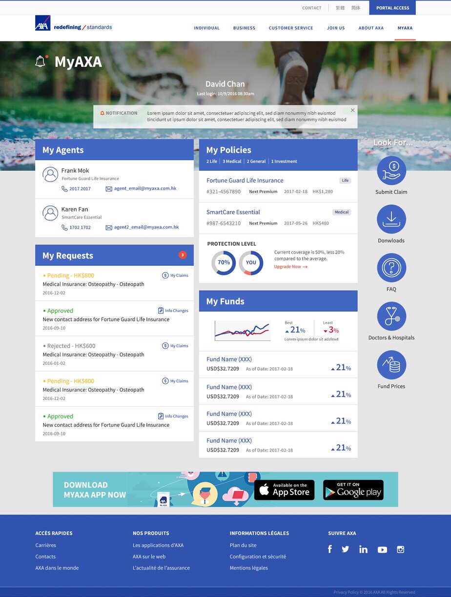
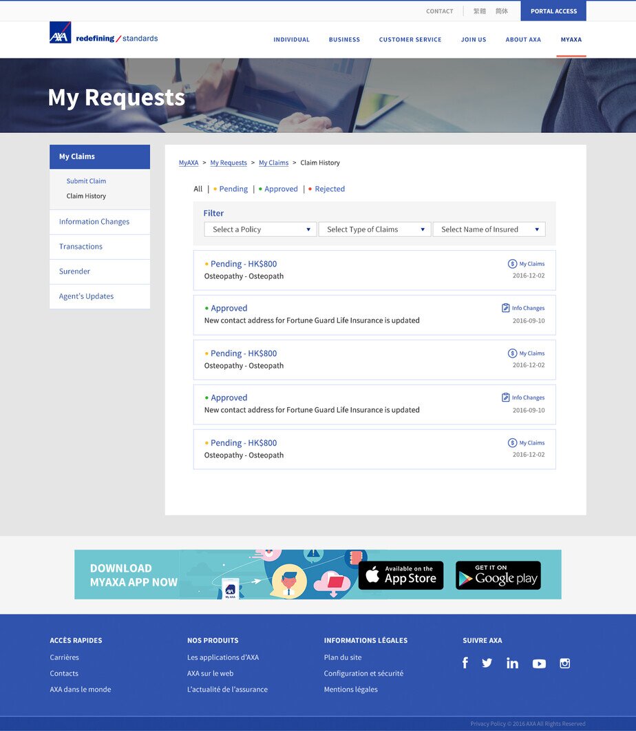
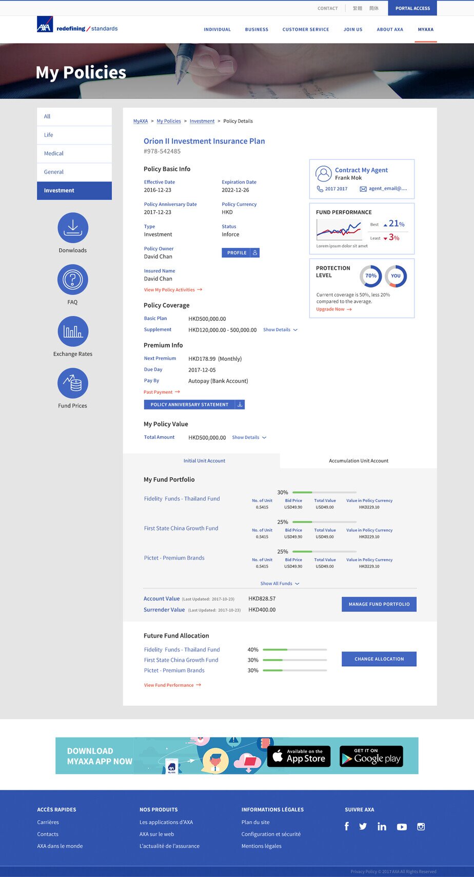
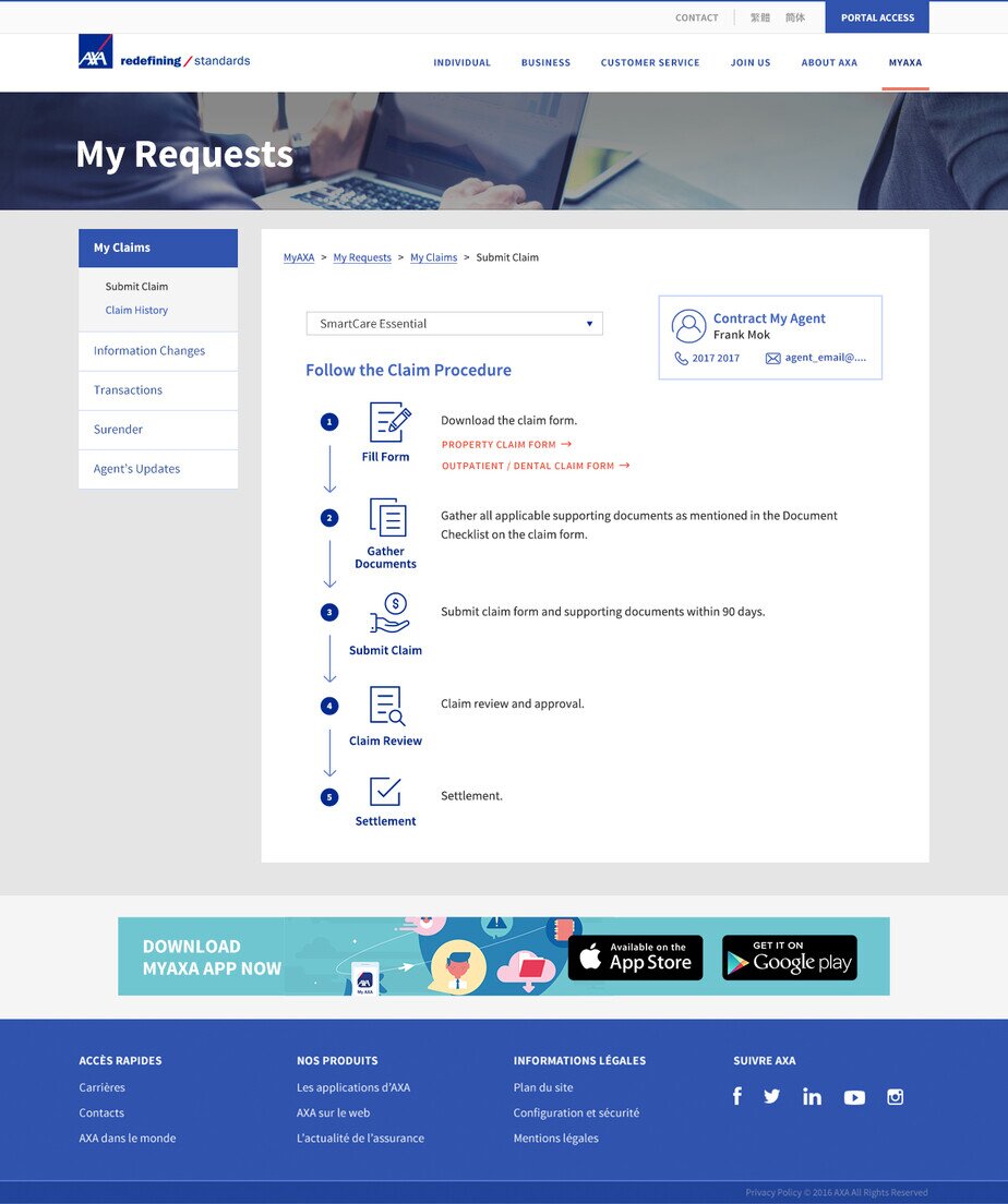
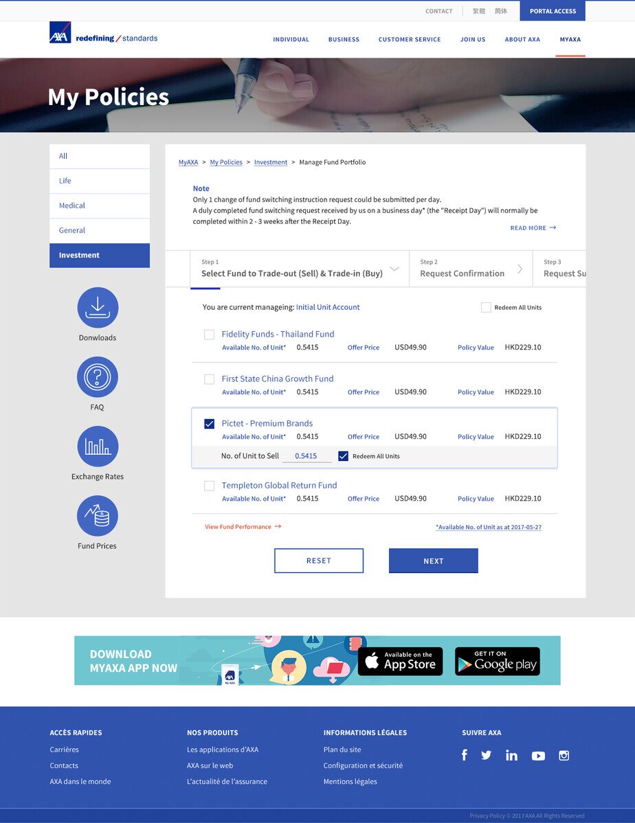
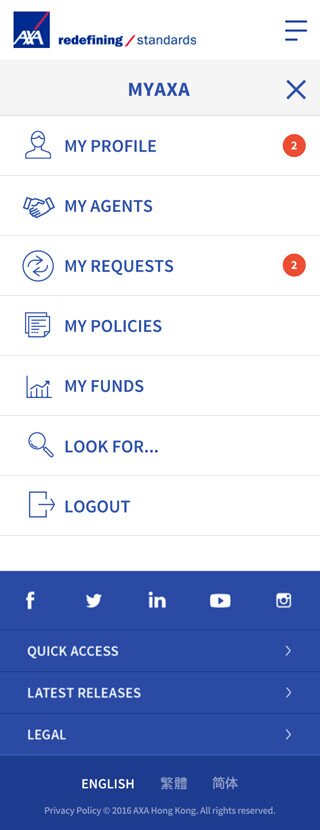
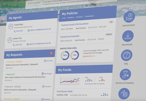
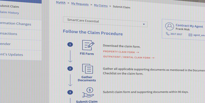
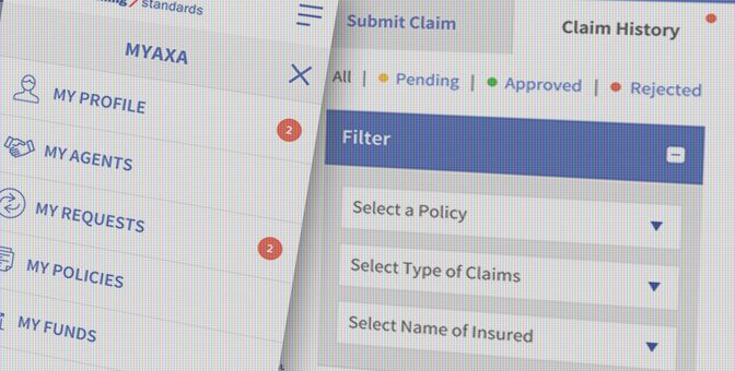
AXA decided to enhance customer experience by developing one single portal across all of their life, medical protection, and investment products. Their goal was to present a consolidated portfolio from the customer's point of view. No matter whether on smartphones, tablets or desktops...the most popular digital devices, their new portal would guide users, and guarantee that they could access and manage their plans, benefits, amounts, and all other useful materials – in the simplest and most consistent way.
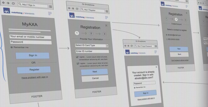
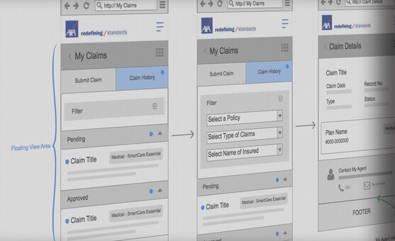
To deliver a superior customer experience with a reliable and user-friendly portal, everything starts from the UX wireframing. Firstly, we studied the research of customers' profiles, usages and needs, come out the outline of all must-have items. We worked very closely with AXA's UX/UI team, to align the corporate image, visual direction and realistic operation workflows, in order to deliver the ideal interface to better engage the customer with the AXA brand. The final solution is successful which empowers the past records and control panel, in a new, comfortable, responsive and consolidated environment - MyAXA.

