Project Goal
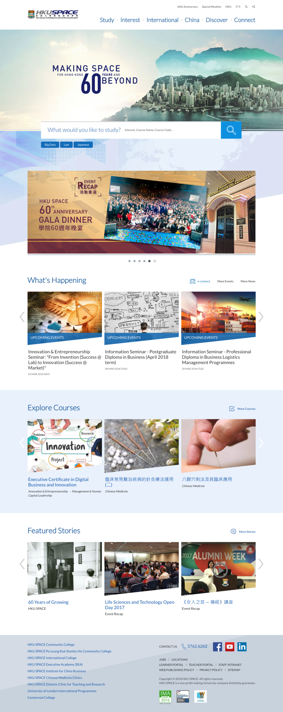
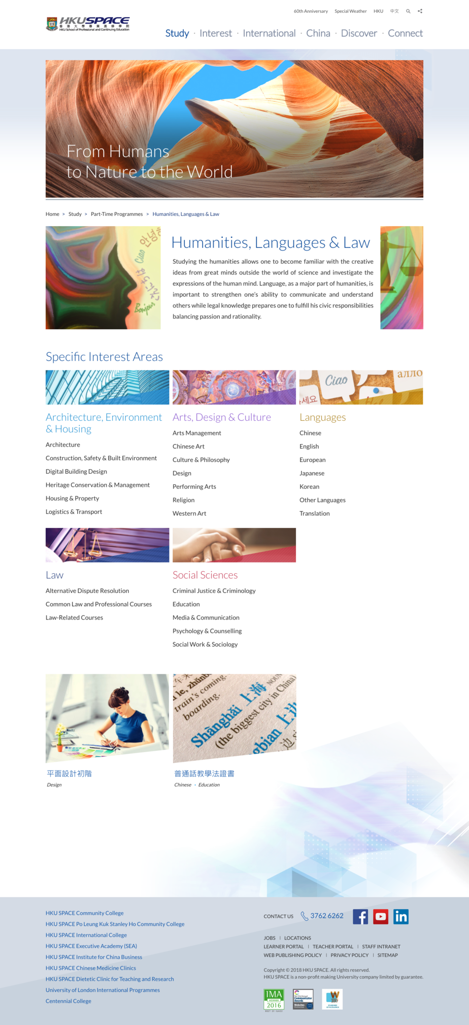
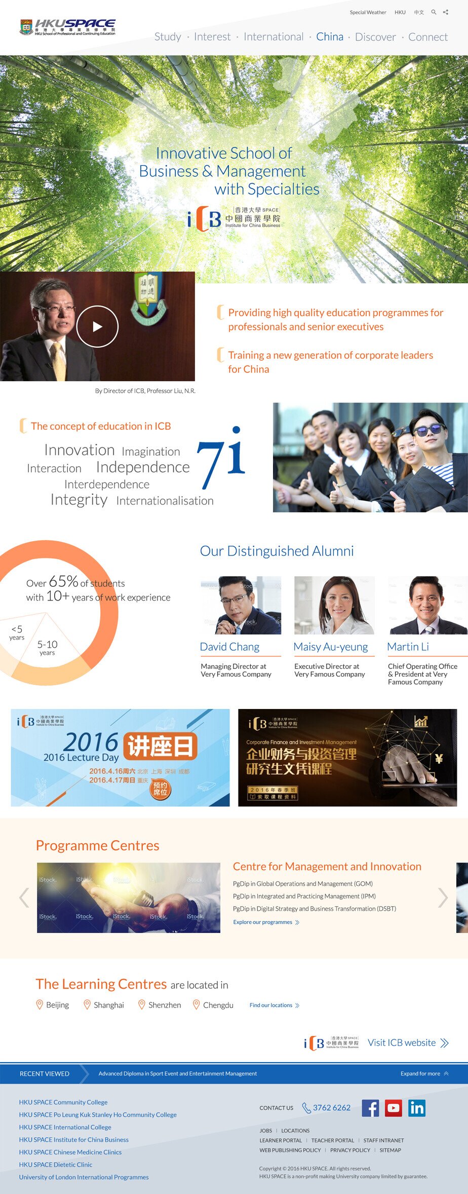
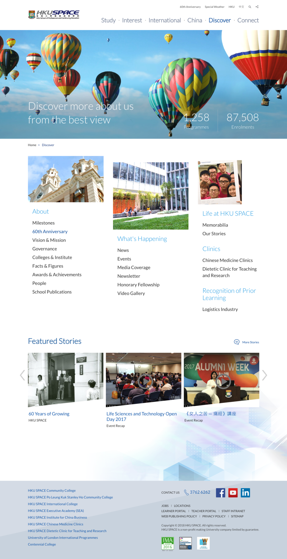
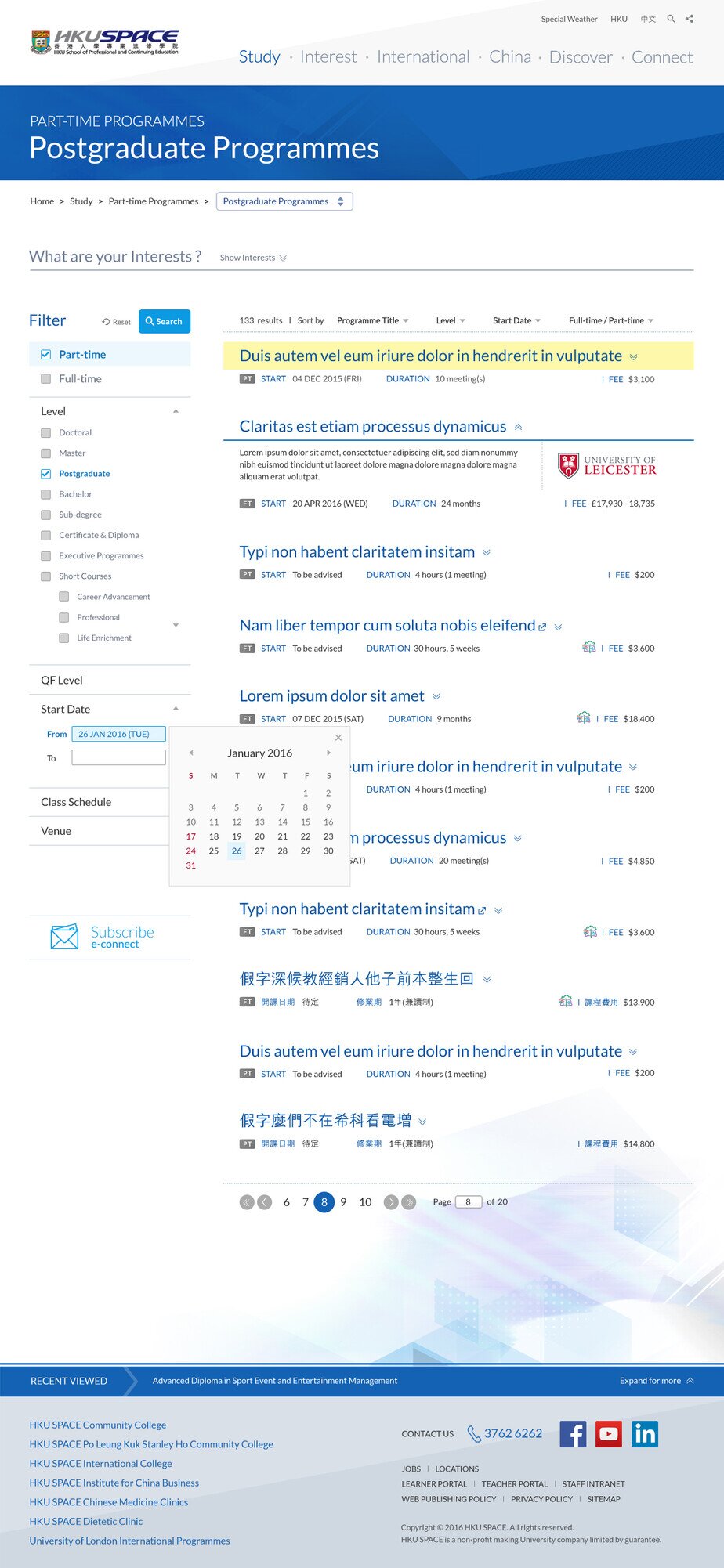
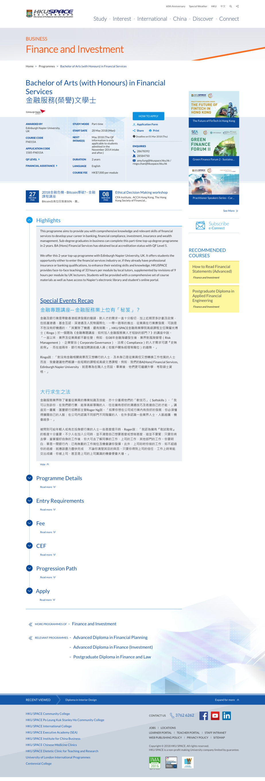
HKU SPACE wanted a total makeover for its website – to shift the major channel of course information from printed media to digital media.
Project HKU SPACE Website
Client HKU SPACE
How to Achieve
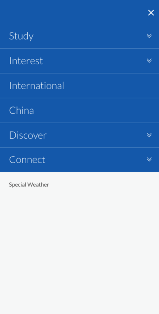
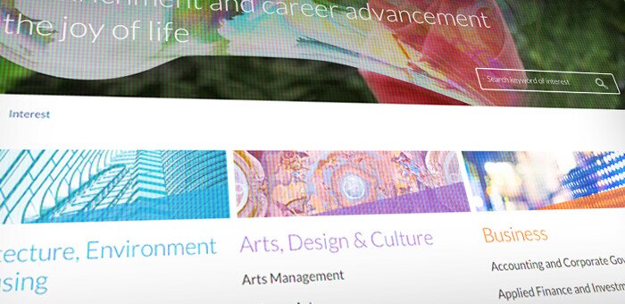
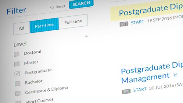
We brought minimalism to the HKU SPACE website. We stripped down previous bulky visual elements – to emphasise the focus on the search function and course information. Simpler, Clearer, Faster – we achieved this by building a more intelligent and user-centric solution in the back-end.


